Affinity Business Development is a woman-owned business development company that uses their positive energy, natural ability to connect people, and large network to help their clients grow and thrive.
Explore.
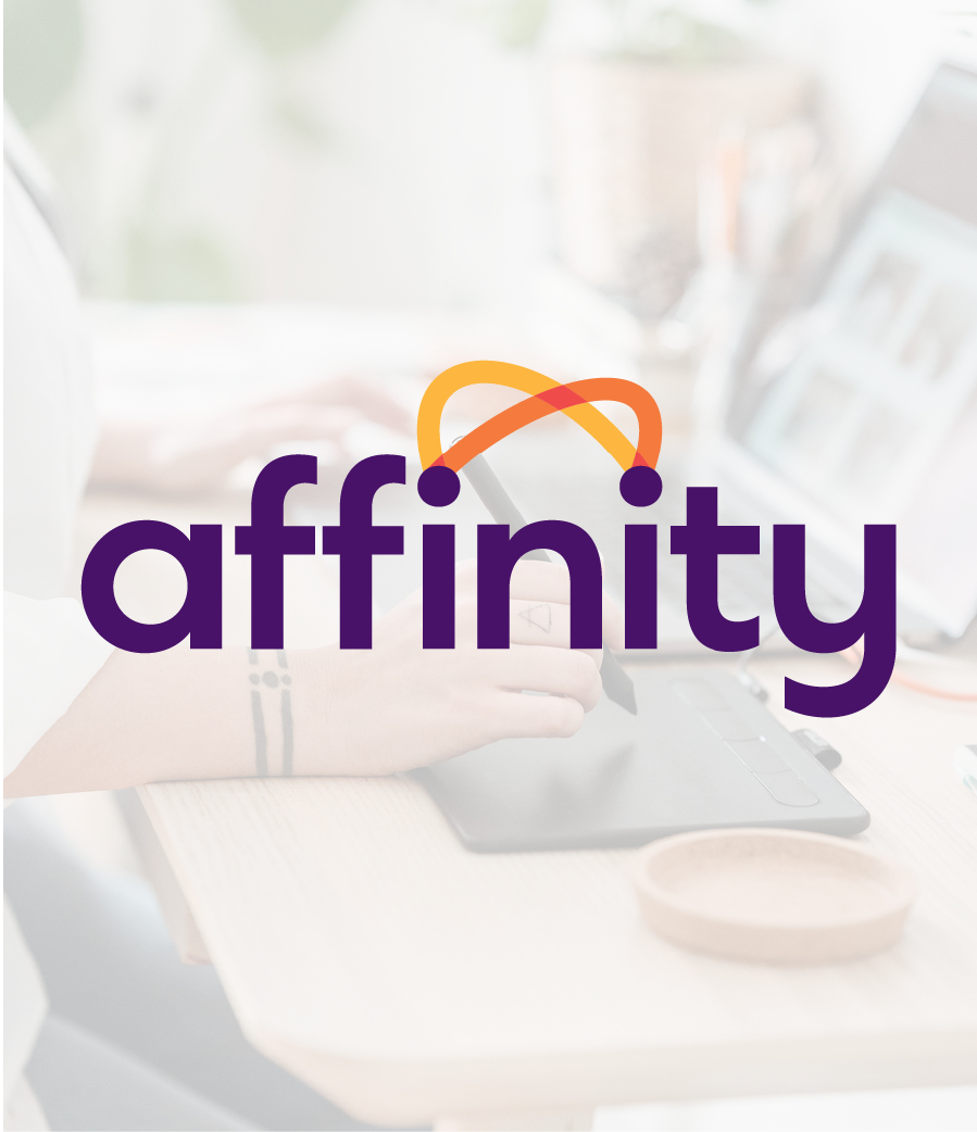
We explored design concepts that represent their positive nature and ability to connect people. Our research of competitors helped us find a way to stand out through the use of vibrant, warm colors and a friendly lowercase font.
Create.
The logo uses the two i's in the word affinity to create wave-like lines between the two dots to represent conversation and connections. The color purple symbolizes her passion for people, contrasted with two warmer colors to show vibrancy, energy, and warmth.
Connect.
For the visual identity, we chose photography with candid and warm expressions along with natural and conversational poses. The addition of an accent script font creates a sense of personal handwriting to reinforce her personable and welcoming nature, creating a closer connection to each client.
© Scouter Design


Go to next project →
