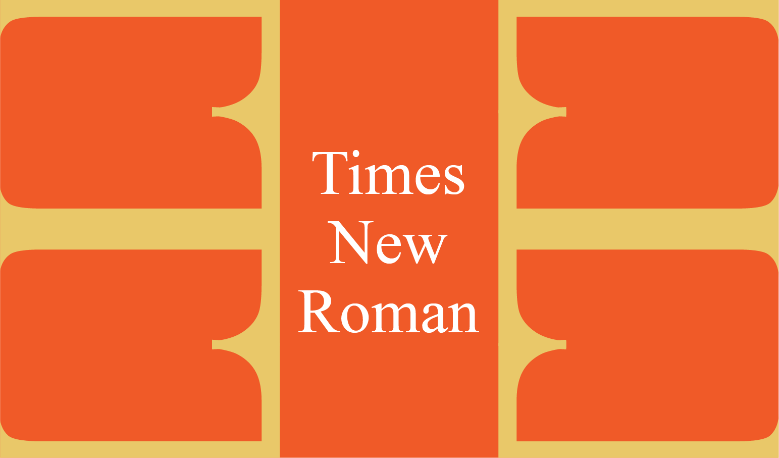
When a proposal comes along with strict formatting requirements, do you groan and plod ahead or do you take it on like the warrior that you are? The use of 12 pt. Times New Roman is a common requirement among federal proposals because of its legibility and narrow character width that allows for more characters per line. With this requirement, is it possible to push the boundaries to create an engaging document? Yes!

Did you know that Times New Roman was designed in 1932 by Stanley Morison and Victor Lardent for the British newspaper, The Times?
"Stanley Morison criticized London’s newspaper The Times for being out-of-touch with modern typographical trends. So The Times asked him to create something better."
-Meredith Mann, Manuscripts and Archives Division, New York Public Library
The US State Department must have felt the same way about their required font choice of Courier so in 2004, they changed their standards to 14 pt. Times Roman.
If we view these requirements as guardrails and the default solution as the center line, we can find ways to deviate from what is expected without driving out of bounds.
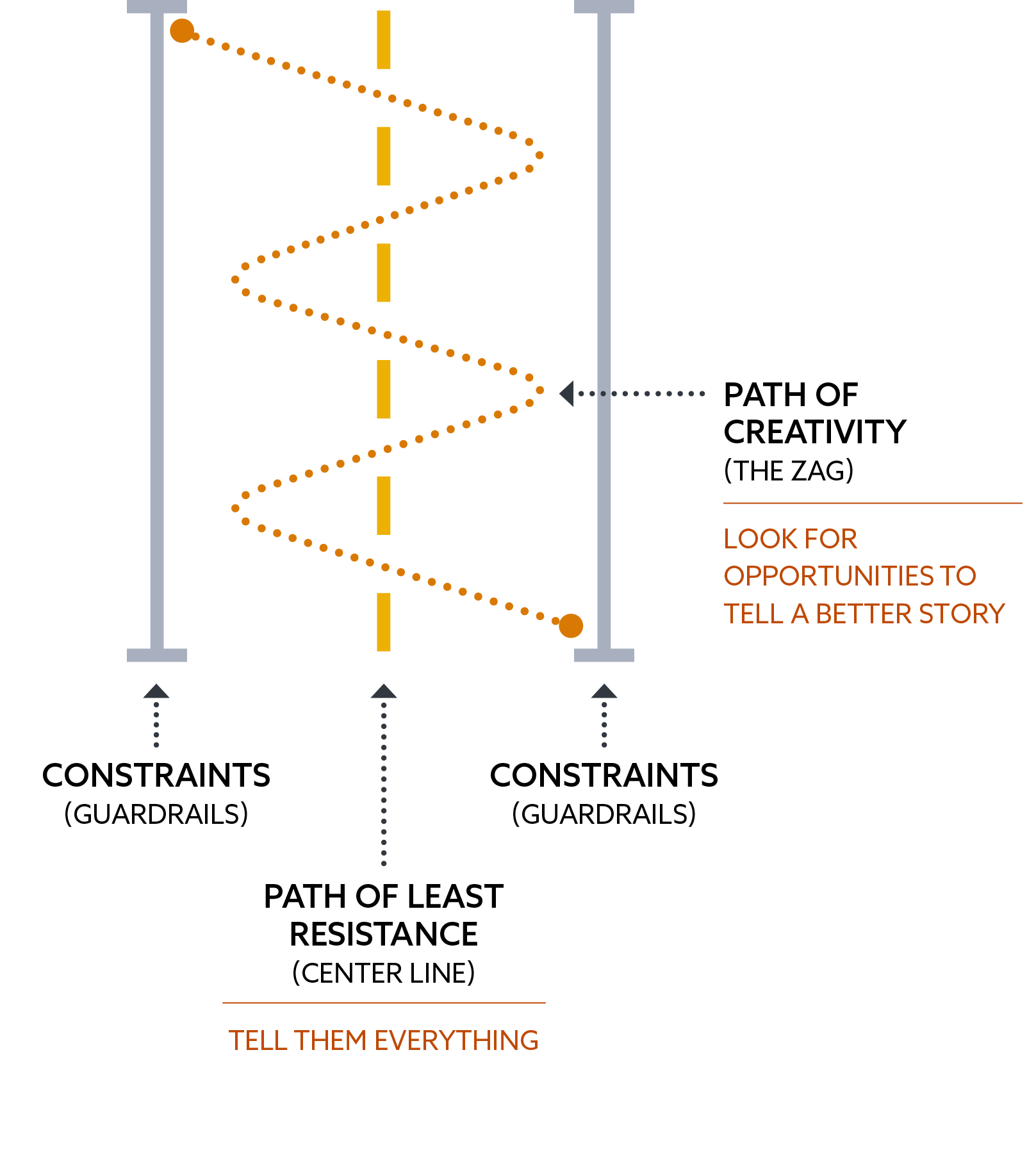
This challenge requires writers and designers to get creative. How do we tell our story, keep it concise, yet still provide enough information to make it clear that we're the right person for the job? The default behavior is to squeeze as much information as possible onto each precious page, forcing the reader to dig for information. There are two things that we can focus on to avoid this trap: 1. Know your readers: what do they need to learn from you? and 2. Make it easy for them to find that information.
If we write and design with the reader's experience in mind, it will steer us towards a more strategic solution by highlighting what they value most. Storyboarding is one method that can be used to build that story because it forces us to look at the story from a broader view. This method helps us sort through all the information we think we need to include, eliminate what isn't necessary, identify where graphics can tell the story better, and organize the content so it flows smoothly from topic to topic. The best part about using storyboards is that they serve as a reference (that hopefully everyone agreed to!) to point back to when the team starts to get off-track.
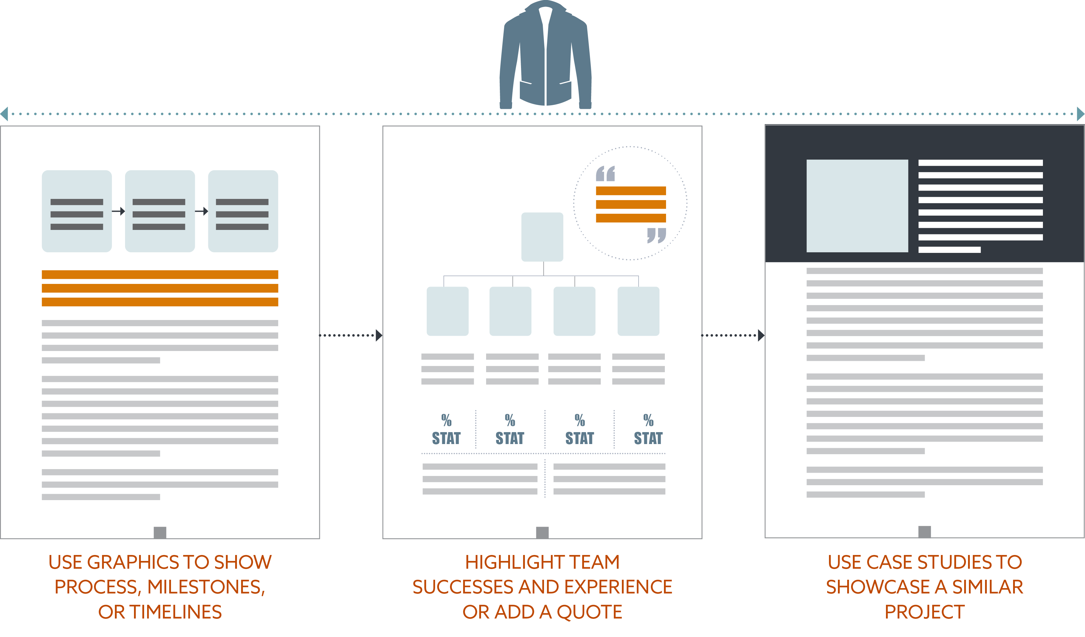
Look for opportunities to say more where they don't expect it. For example, use the team org chart to highlight some of the team's prior successes; or use the steps in a typical process chart to point out where you'd do things differently and why; or use resumes to tell a better story by highlighting where you solved a similar problem before. Sometimes quality is better than quantity - a few really good examples of projects that are relative to the client's needs may be more effective than ten projects with no compelling story behind it.
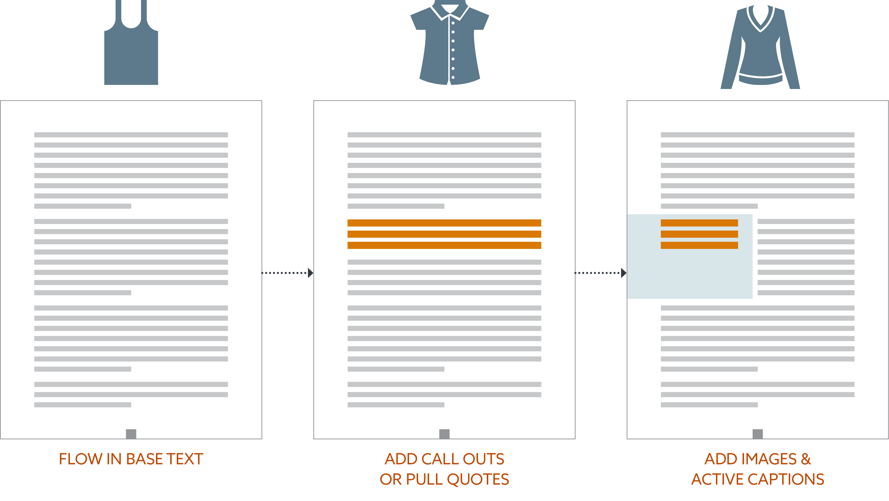
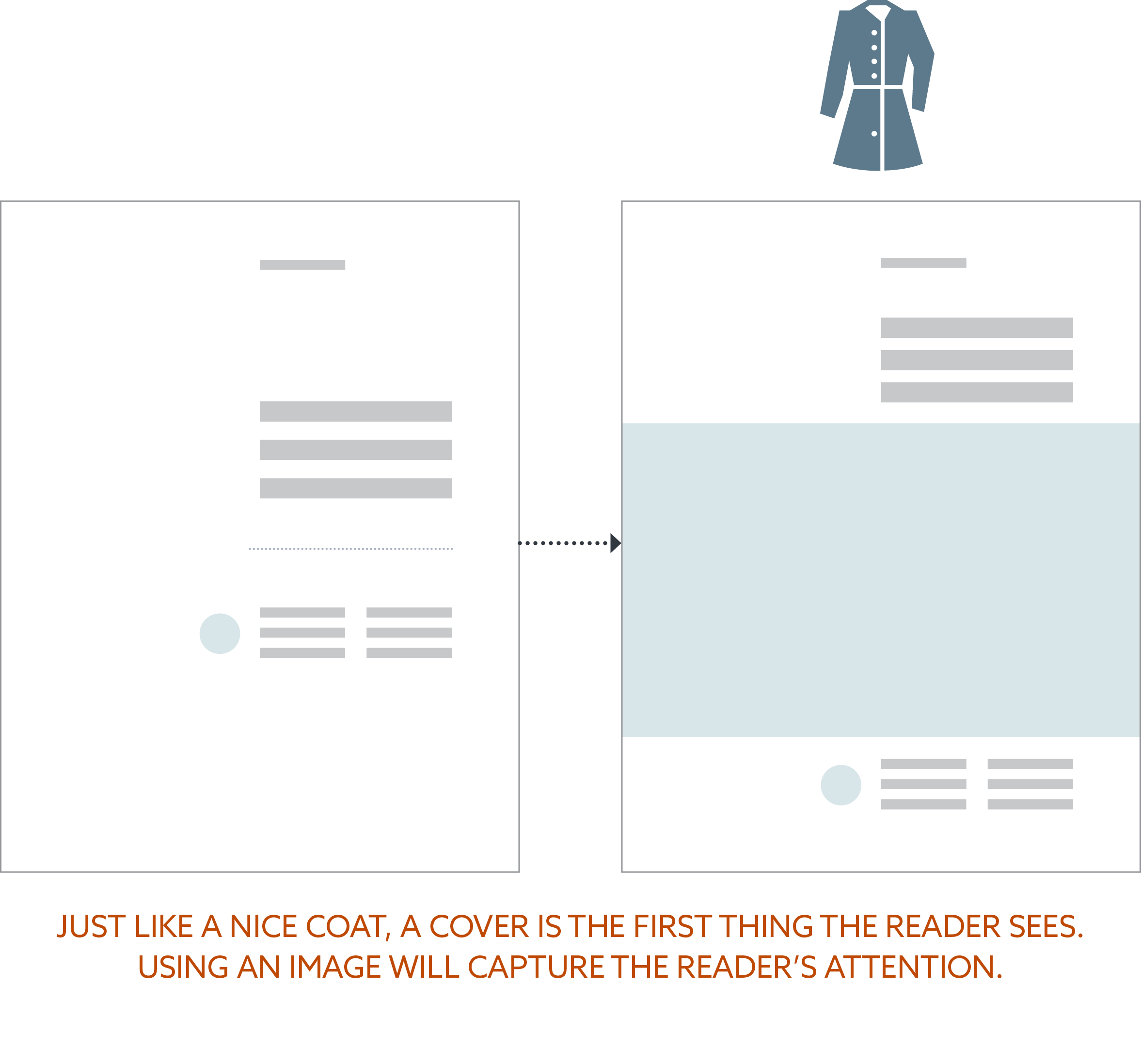
For designers, dissect the story and its main selling points and use hierarchy to start building those visual layers. When designing, I always think of a document as an outfit with multiple layers of clothing. First, flow in the base text; then extract the most important information and highlight it using various elements like side bars or pull quotes; after that, incorporate images with active captions; and finally add any graphics or charts in place of content that describes processes, milestones, data, or timelines. These layers of design should reveal enough of the story so the reader who is skimming the document will still come away with the main winning themes. These visual layers make it easier for the reader to find and retain information.
The lesson here is that despite limitations, there is always room to be curious, try new things, and be creative while still addressing the client's needs. A visually interesting document with a well-thought out story could give us an advantage over other submissions because it shows that we are willing to invest the time to craft a story solely for that client. And that gives the client insight into the quality and care we will put into their project. Having guardrails is good. It's what you choose to do inside of them that sets you apart.
Resources:
https://www.nypl.org/blog/2014/12/09/times-new-roman
https://fam.state.gov/FAM/05FAH01/05FAH010410.html
© Scouter Design
Follow me on Facebook: @ScouterDesign | LinkedIn: ScouterDesign
