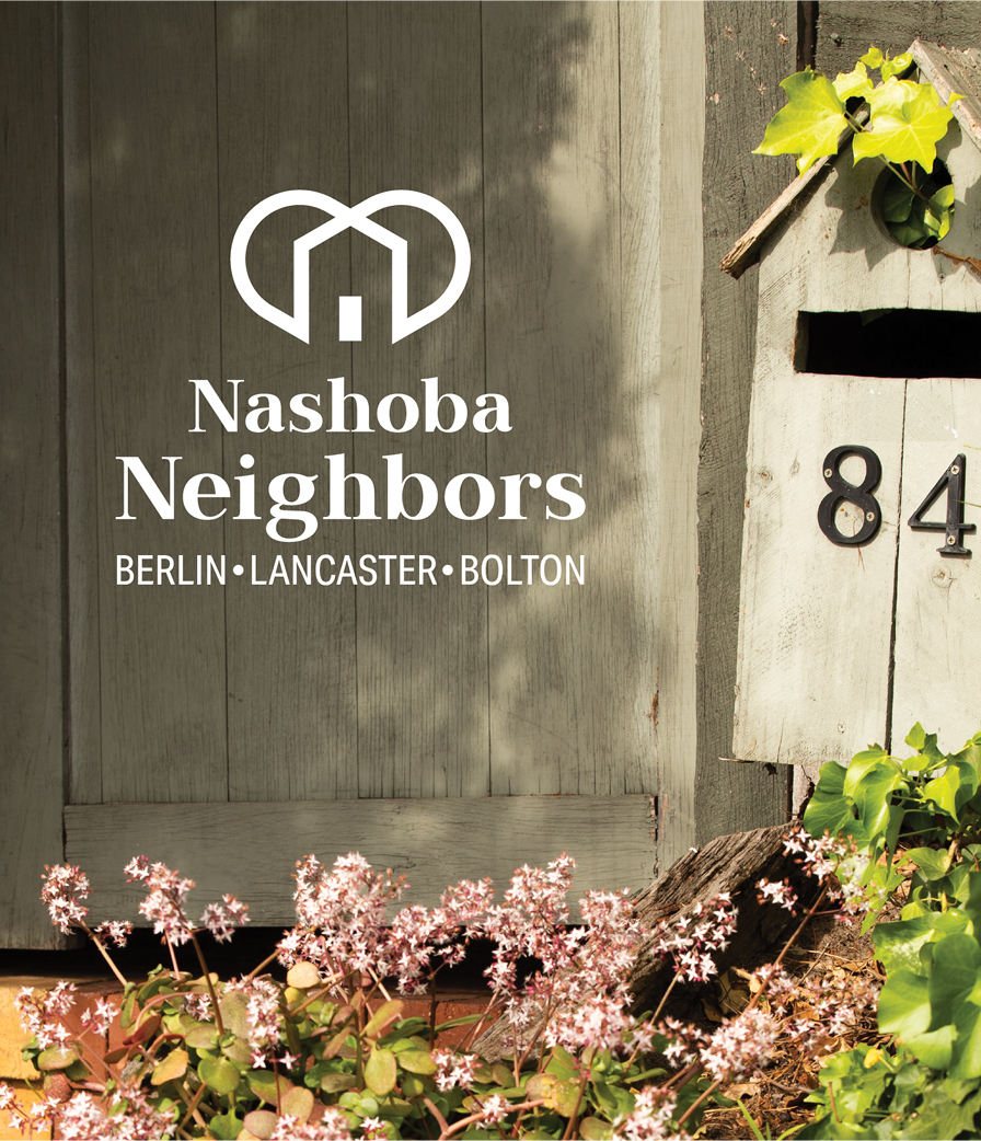
Nashoba Neighbors is a local non-profit designed to help older adults stay engaged, connected, and active in their own homes and communities by providing services and support such as transportation, handyman services, social events, and shopping. It is made up local volunteers and operates within three communities in MA: Berlin, Bolton, and Lancaster.
Explore.
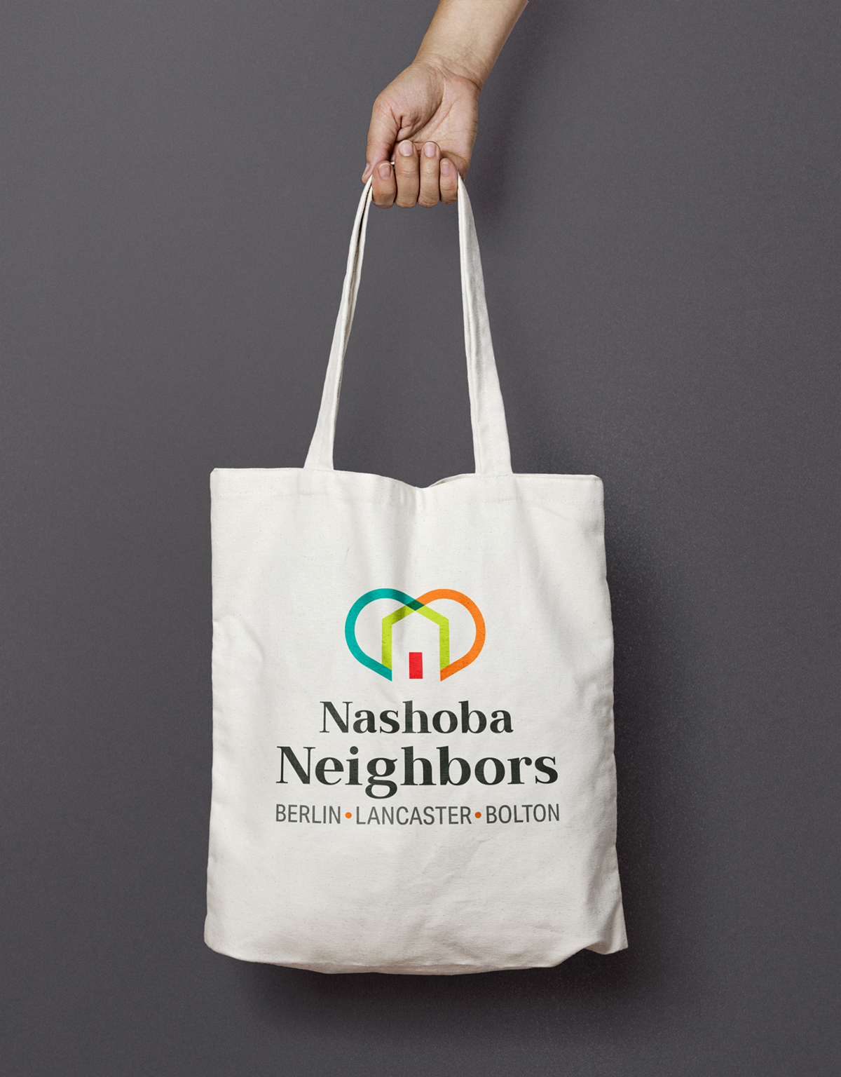
Initially, this project was to take the original logo and turn it into vector-based artwork so that it would retain its sharpness and be scalable. The original logo was an abstract interpretation that represented the three local communities. The client was open to looking at other options, so we explored symbols and ideas that represent the adjectives the client used to describe its organization: Community, Thrive, Caring, Together.
Create.
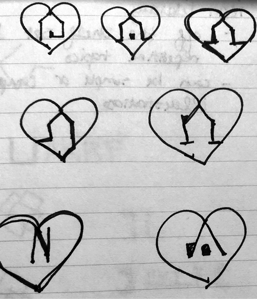
Our research led us to symbols for doorways, pathways, homes, clusters of 3 (to represent the 3 communities), hearts, and personable typography. We forged our concepts from there and utilized a brighter color palette that was uplifting and modern and a friendly serif font that is personable like their team of volunteers.
Connect.
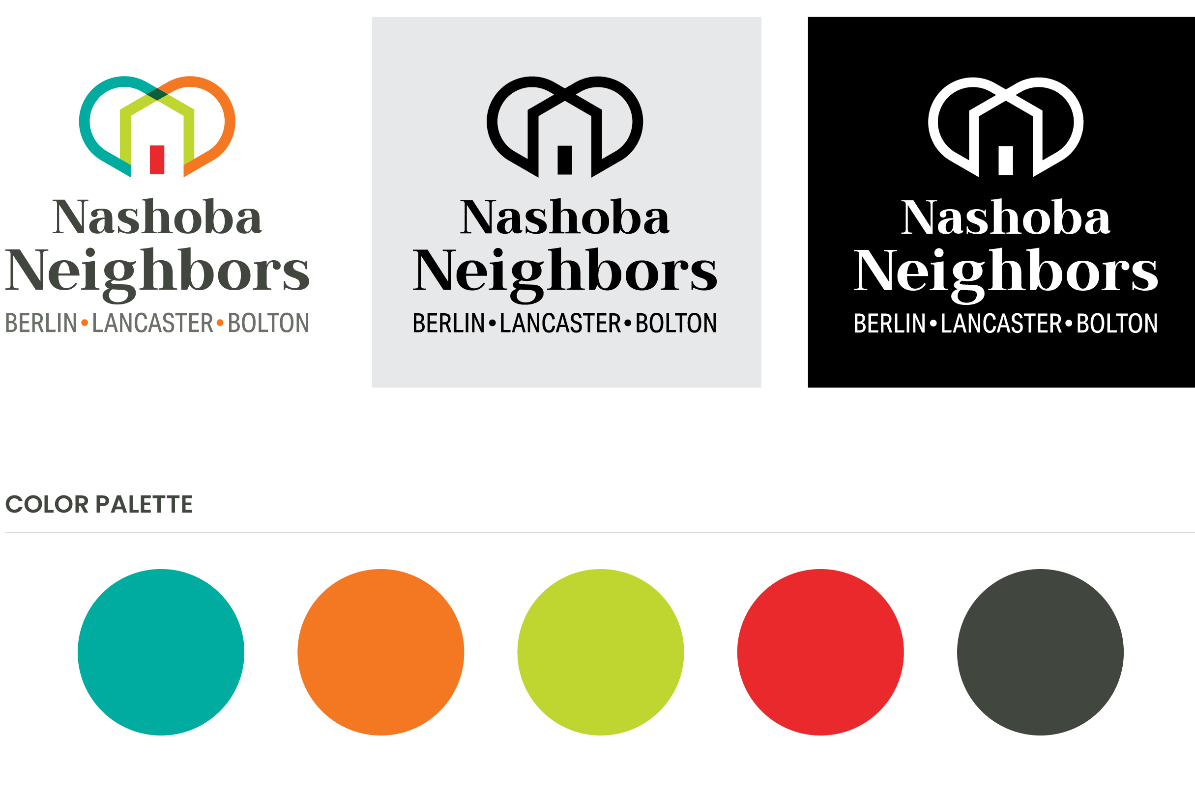
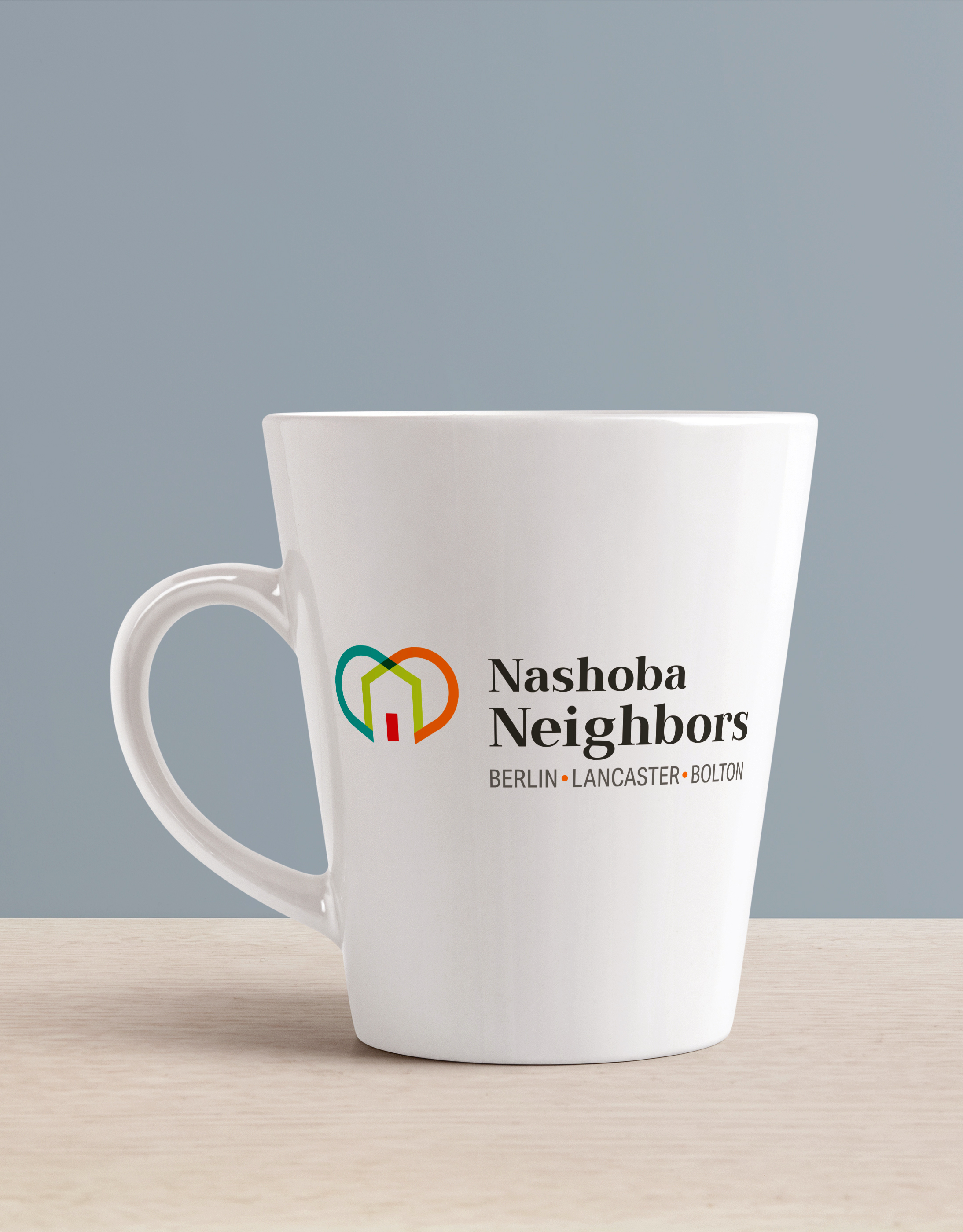
The new logo sets itself apart from the sea of other logos used in the same industry through the use of bold colors and a clean, modern design. The design's simplicity makes it flexible enough to be used in a wide range of situations such as collateral, signage, presentations, and giveaways. It also provides a solid foundation for the team to build out its brand as they move forward.
There is so much to be gained by using our skillsets to help others. And as this Group gains in popularity and further develops its brand, the logo will provide a consistent, visual cue to local clients that is distinctly Nashoba Neighbors. Want to learn more about this amazing group of people or to join? Visit their FB page at https://www.facebook.com/NashobaNeighbors.
© Scouter Design
Go to next project →
